Baskerville Type Specimen
A personal favorite from design school!
An 8-page type specimen booklet showcasing forms and composition through contrast and unity
Timeline
4 weeks
Project Type
Typeface Specimen
Booklet Design
Print Production
Print Quality
8-page staple-bound booklet
5” x 5”, black and white only
Tools and Software
Adobe Illustrator
Overview
One font, eight compositions
The Brief
The task was to design an 8-page type specimen that had specific criteria for each panel composition. I was only allowed to use one font, which was the topic and subject of the booklet, and that font was assigned to me at random.
The Constraints
One font only throughout the entire typesetting
Select six characters (4 letters, 1 number, and 1 symbol) to use as graphic elements for the compositions
Communicate a comprehensive understanding of the font through each composition
Focus on the sequencing, pacing, and storytelling throughout your typesetting
My Approach
I approached the challenge by building a strong narrative based on my research of Baskerville’s history and design.
By deeply understanding the typeface in context, I identified key graphical components and visual motifs of Baskerville’s letter forms that allowed me to experiment with compositions while adhering to an overall, unified theme.
Research
Understanding the typeface
Gathering Inspiration
I referred to Ellen Lupton’s book, Thinking with Type, to gain a better understanding of Baskerville’s historical context, and to understand how and why it was designed.
Afterwards, I visited the Letterform Archive in San Francisco to see original specimens of the typeface to gather inspiration for my booklet.
Key Takeaways
John Baskerville, 1750’s
Baskerville was a printer and master calligrapher
Influenced by an era of enlightenment, abstraction, and industrial advancements
Designed to reflect both the calligraphic and printing advancements of his time
Classified as a transitional font, marking the transition from humanist to modern typefaces.
Interpretation
Forming a theme, selecting subjects
The next step was to form a theme based off of my research, and to select six characters to use as the main graphicial elements in my compositions.
Sequence Theme
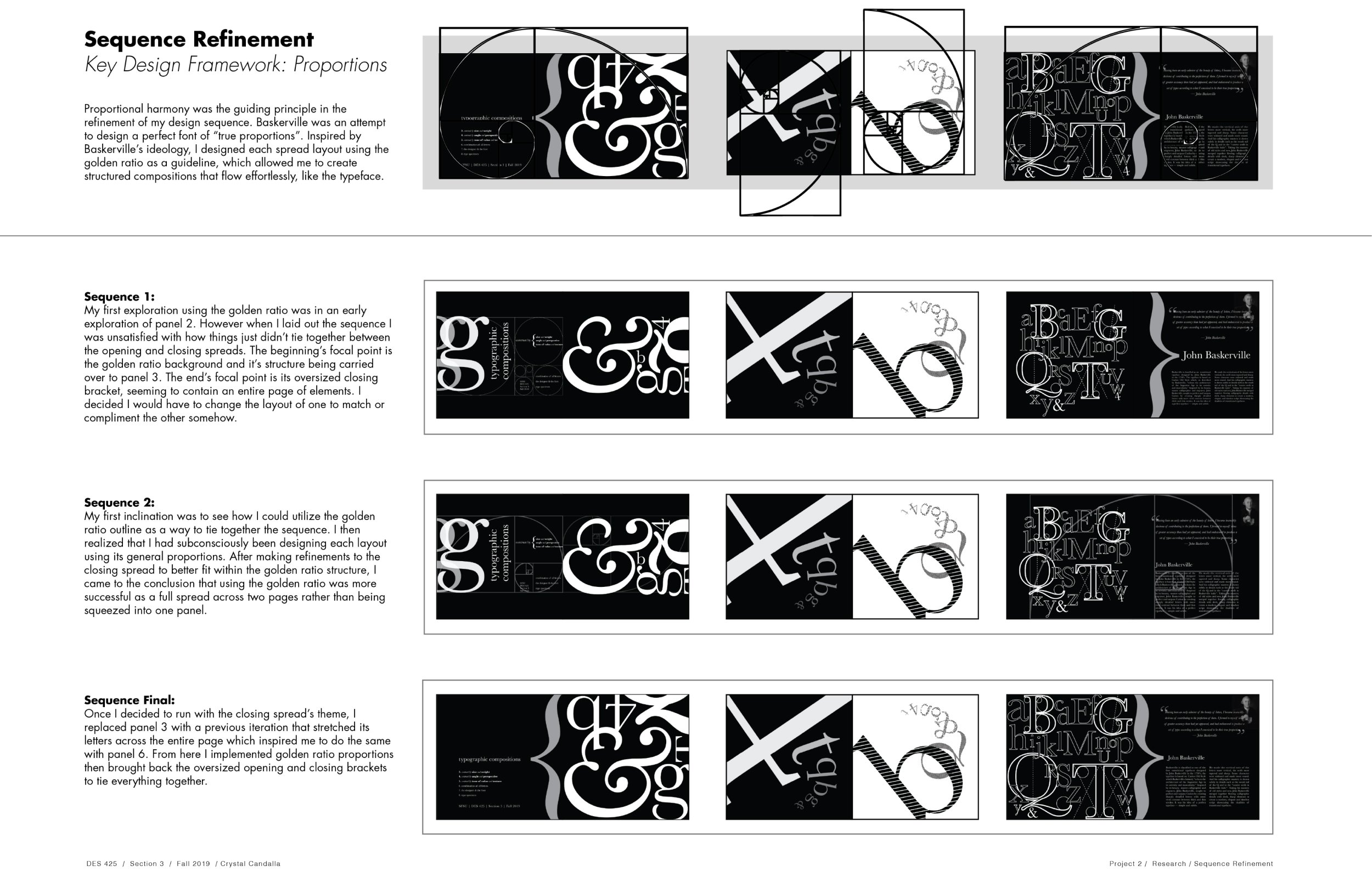
Based off my research, I decided to go with a “transitional” theme. My idea was to showcase a transition from calligraphic elements to more mechanical elements by the end of the booklet sequence. Later on, I decided to integrate Baskerville’s more specific themes of “idealism” and “perfectionism”, shown through the symmetrical and proportional use of layout.
Character Selection
I decided to use six key characteristics I had gathered in my research to use as a guideline for my selection process.
I began by printing out 4 cuts of the Baskerville typeface with my list of key characteristics in view. Then, I went down my list and analyzed the letterforms of each cut, circling the characters that I felt best represented the characteristic in focus.
Key Characteristics
Sharp forms
Calligraphic details
More horizontal head serifs
Stroke contrast
Sharp serifs
Vertical axis
Ideation
Iterations and feedback
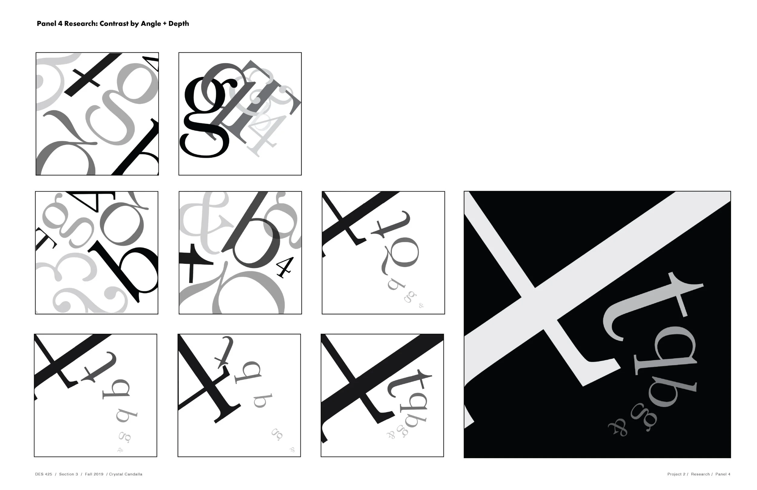
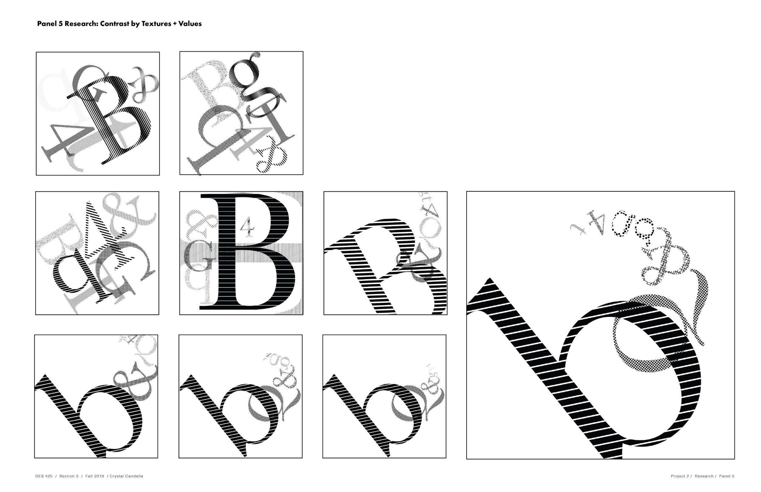
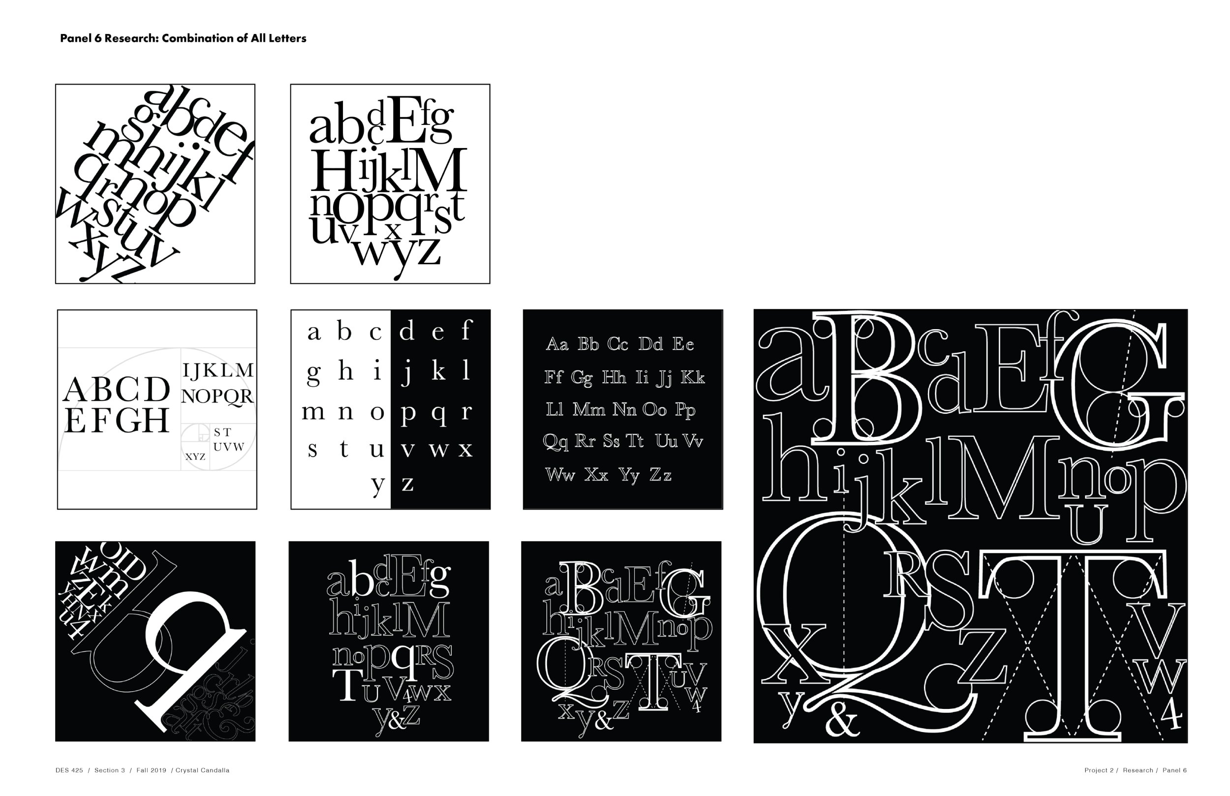
We had around 2 weeks to iterate on different compositions and sequences. Each iteration was followed up with a group critique where I received helpful feedback and suggestions from the class. I continued to iterate on different variations based these critiques until I finalized my design and booklet sequence.


Prototype
Test Prints
After feedback and changes, I prototyped the final design to get a hands-on feel of the content and composition sequence.
With a physical prototype in hand, I was able to see flaws in the design that I wouldn’t have been able to otherwise.
After a final critique, I made revisions to my cover image and fine-tuned some of the details and spacing in my compositions.
Finished Product
Final Design
Other Projects


